This analysis focuses on employee attrition using data from the IBM HR Analytics Employee Attrition & Performance. It explores possible reasons why employees leave their jobs and the process used to identify these insights. The examples provided illustrate key factors influencing attrition, but in a real-world setting, a more comprehensive analysis would be necessary.
1 Peronal Factors
1.1 The Role of Age in Employee Attrition: Trends and Insights
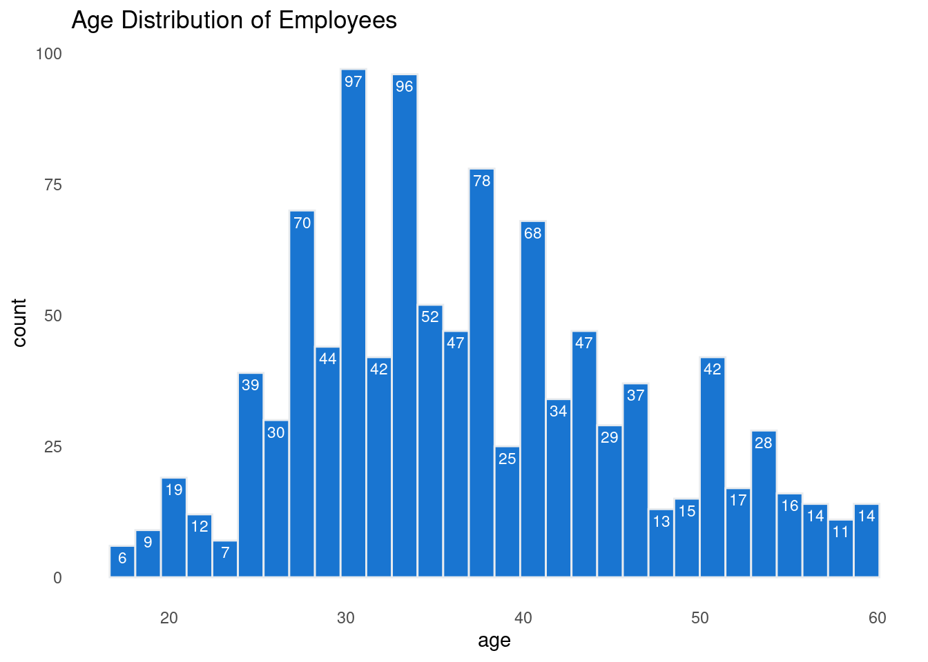
What is the distribution of age?
To start my analysis I decided to look if there is a certain age group that seem to be leaving the organization more than others. First I had to look at the age distarbution to determine the size and range of my bins.
The following graph visualize the age distribution to identify natural groupings for analysis.
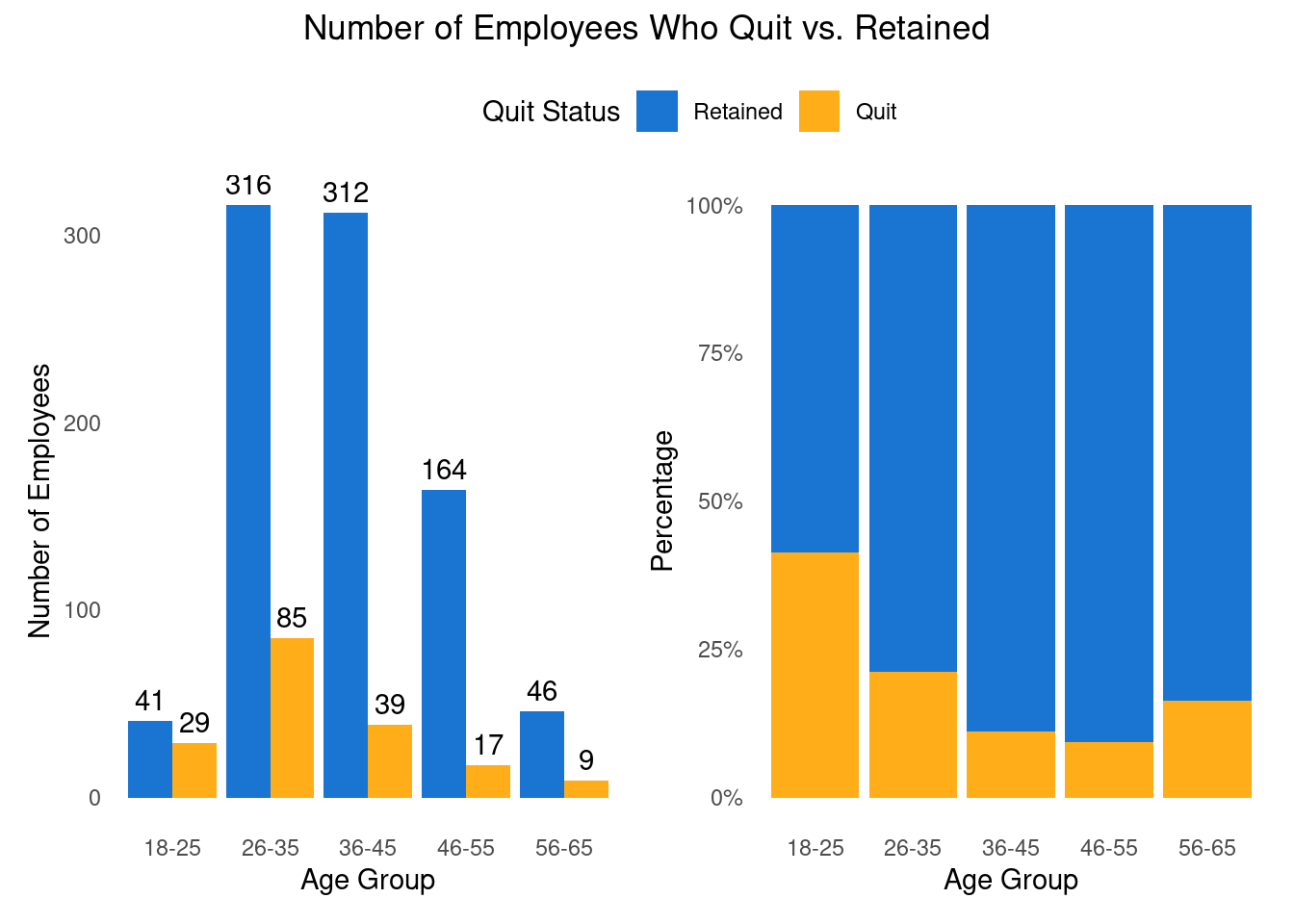
Then I added a column that divided the ages into the groups I wanted. In addition, the Attrition column given as 0 (retained) and 1 (quit), therefore I re-coded the data to a factor, which will help me in the analysis moving forward.
The following two graphs looks at age group and quit status. The graph to the left point out that more employees who belong to age group 26-35 quit. However, the biggest age group in the data is employees between the age of 26-35 so it is not a surprise that it will be more people quitting there than other age groups. Therefore, it is important to look at the age group percentage. The graph to the right point out another age group that we should pay attention to, employees between 18-25. We can see that with age the quit rate decrease and than increase again when people are passing 56 year of age. Although there are differences in age, this analysis in not enough to determine age is the reason for quitting. Next I am going to test other possibilities that might contribute to employee attrition.
2 Categorical Analysis Using Chi-Square
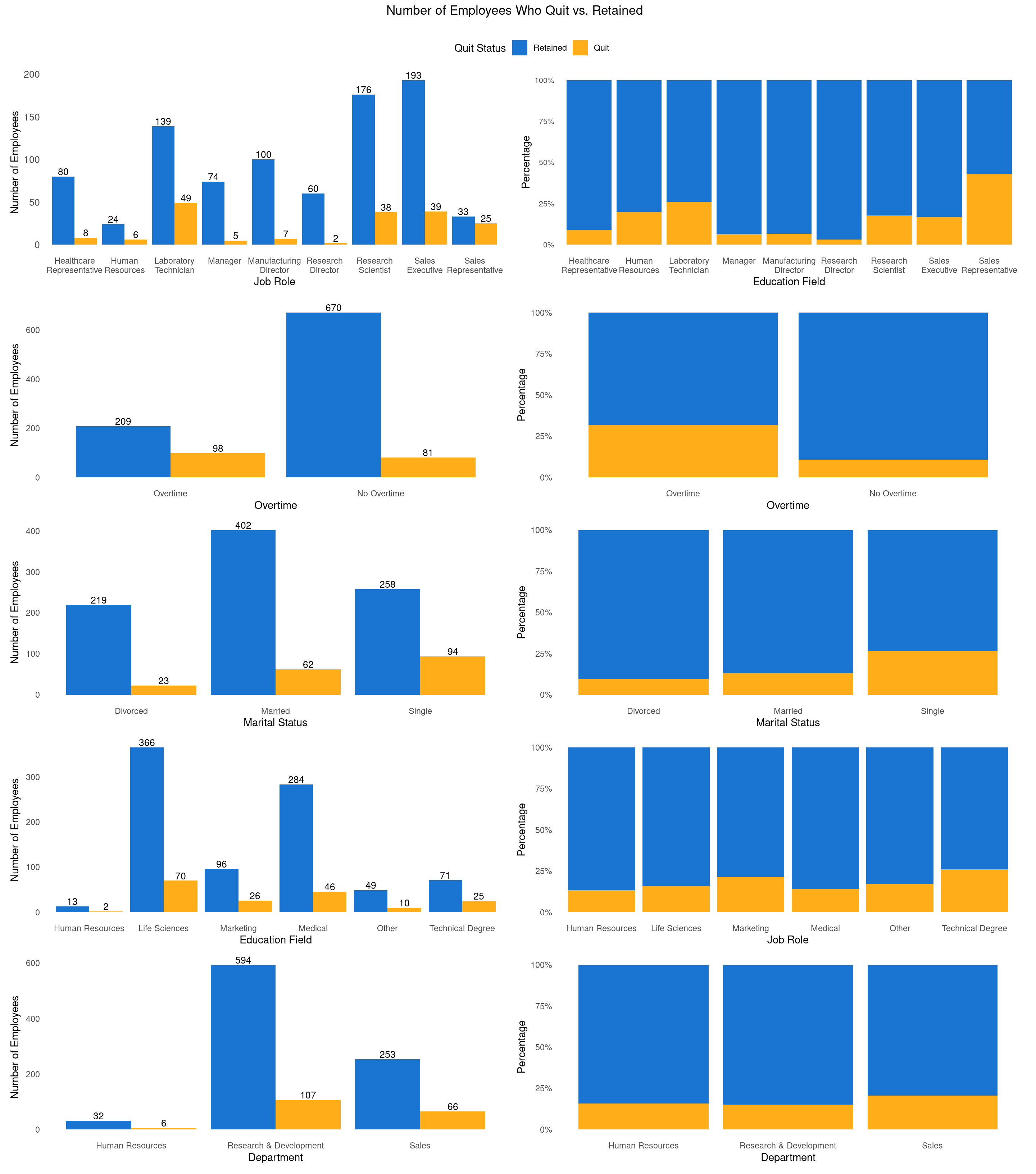
A Chi-Square analysis was conducted to examine the relationship between Quit Status and several categorical variables, including gender, department, job role, marital status, and overtime. Job role, marital status, and overtime showed significant differences (p < 0.05), while department and education field had p-values less than 0.10, suggesting potential trends. These variables will be further explored to assess their role in predicting employee turnover.
Chi-Square Test Results for Quit Status vs Other Variables
Variable
Chi-Square Test Statistic
P-Value
Gender
0.2
0.66
Department
4.6
0.10
Job Role
66.4
0.00
Education Field
9.8
0.08
Marital Status
37.6
0.00
Overtime
67.8
0.00
2.1 Digging Deeper - Categorical Variables
What Factors Influence Employee Attrition?
Source Code
---title: "Understanding Employee Attrition: Data-Driven Insights"author: ""date: ""format: html: html-table-processing: none page-layout: full include-after-body: abbrv_toc.html number-sections: truetoc: truetoc-depth: 2toc-title: Contentscss: custom.cssfilters: - lightboxlightbox: auto---This analysis focuses on employee attrition using data from the [*IBM HR Analytics Employee Attrition & Performance*](https://www.kaggle.com/datasets/pavansubhasht/ibm-hr-analytics-attrition-dataset). It explores possible reasons why employees leave their jobs and the process used to identify these insights. The examples provided illustrate key factors influencing attrition, but in a real-world setting, a more comprehensive analysis would be necessary.# Peronal Factors## The Role of Age in Employee Attrition: Trends and Insights {toc-text="Age"}```{r}#| output: false#| include: false#| warning: falselibrary(tidyverse)library(janitor)library(ggpattern)library(here)library(patchwork)library(gt)library(scales)library(GGally)library(stringr)ibm_data <-read_csv(here("ibm_dataset","ibm_dataset.csv")) |>clean_names()```> What is the distribution of age?To start my analysis I decided to look if there is a certain age group that seem to be leaving the organization more than others. First I had to look at the age distarbution to determine the size and range of my bins.The following graph visualize the age distribution to identify natural groupings for analysis.```{r}#| echo: false#| warning: falsep1 <-ggplot(ibm_data, aes(x = age)) +geom_histogram(fill ="#0066CC", color ="#e9ecef", alpha =0.9) +stat_bin(aes(label =after_stat(count)), geom ="text", color ="white", vjust =1.5, size =3) +theme_minimal() +theme(panel.grid.major =element_blank(), panel.grid.minor =element_blank()) +labs(title ="Age Distribution of Employees")p1```Then I added a column that divided the ages into the groups I wanted. In addition, the Attrition column given as 0 (retained) and 1 (quit), therefore I re-coded the data to a factor, which will help me in the analysis moving forward.```{r}#| echo: falseibm_data <- ibm_data |>mutate(quit_status =factor(attrition,levels =c(0,1),labels =c("Retained","Quit")),over_time =factor(over_time,levels =c("Yes","No"),labels =c("Overtime","No Overtime")),age_group =factor(cut(age, breaks =c(18, 25, 35, 45, 55, 65), labels =c("18-25", "26-35", "36-45", "46-55", "56-65"),right =FALSE)) )```The following two graphs looks at age group and quit status. The graph to the left point out that more employees who belong to age group 26-35 quit. However, the biggest age group in the data is employees between the age of 26-35 so it is not a surprise that it will be more people quitting there than other age groups. Therefore, it is important to look at the age group percentage. The graph to the right point out another age group that we should pay attention to, employees between 18-25. We can see that with age the quit rate decrease and than increase again when people are passing 56 year of age. Although there are differences in age, this analysis in not enough to determine age is the reason for quitting. Next I am going to test other possibilities that might contribute to employee attrition.```{r}#| echo: false#| warning: false# Number of Employees Who Quit vs. Stayed Across Age Groupsp2 <-ggplot(ibm_data, aes(x = age_group, fill = quit_status)) +geom_bar(position ="dodge", alpha =0.9) +geom_text(stat ="count", aes(label =after_stat(count)), position =position_dodge(width =0.9), vjust =-0.5) +scale_fill_manual(values =c("Retained"="#0066CC", "Quit"="orange"), labels =c("Retained", "Quit")) +labs(x ="Age Group", y ="Number of Employees", fill ="Quit Status", ) +theme_minimal() +theme(panel.grid.major =element_blank(), panel.grid.minor =element_blank()) # Quit and Retention Percentages by Age Group (Stacked + percent)p3 <-ggplot(ibm_data, aes(x = age_group, fill = quit_status)) +geom_bar(position ="fill", alpha=0.9, show.legend =FALSE) +scale_y_continuous(labels = scales::percent) +scale_fill_manual(values =c("Retained"="#0066CC", "Quit"="orange"), labels =c("Retained", "Quit")) +labs(x ="Age Group", y ="Percentage", fill ="Quit Status") +theme_minimal() +theme(panel.grid.major =element_blank(), panel.grid.minor =element_blank()) (p2 | p3) +plot_annotation(title ="Number of Employees Who Quit vs. Retained",theme =theme(plot.title =element_text(hjust =0.5)) ) +plot_layout(guides ="collect") &theme(legend.position ="top")```# Categorical Analysis Using Chi-SquareA Chi-Square analysis was conducted to examine the relationship between Quit Status and several categorical variables, including gender, department, job role, marital status, and overtime. Job role, marital status, and overtime showed significant differences (p < 0.05), while department and education field had p-values less than 0.10, suggesting potential trends. These variables will be further explored to assess their role in predicting employee turnover.```{r}#| echo: false#| warning: false#| message: false#| include: false# List of variables for which you want to create contingency tables with Quit_Statusvars <-c("gender", "department", "job_role", "education_field", "marital_status", "over_time")# Capitalize the variable names for the outputvars_capitalized <-c("Gender", "Department", "Job Role", "Education Field", "Marital Status", "Overtime")# Create the list of contingency tables with Quit_Status and each other variablecontingency_list <-lapply(vars, function(var) {table(ibm_data[[var]], ibm_data$quit_status)})``````{r}#| echo: false#| warning: false#| message: false#| include: false# Perform Chi-Square test on each contingency table and store resultschi_results <-lapply(contingency_list, function(cont_table) { test_result <-chisq.test(cont_table)c(Statistic = test_result$statistic, P_Value = test_result$p.value, Df = test_result$parameter)})# Collate the results into a data framechi_results_df <-do.call(rbind, chi_results)chi_results_df <-as.data.frame(chi_results_df)chi_results_df$Variable <- vars_capitalized``````{r}#| echo: false#| warning: false#| message: false#| include: false# Format the results into a gt table with capitalized column labels and highlighted p-valueschi_results_gt <- chi_results_df |>rename(chi_test_score =`Statistic.X-squared`, p_value = P_Value, df = Df.df) |>select(-df) |>relocate(Variable, 1) |>mutate(chi_test_score =round(chi_test_score, 1),p_value =round(p_value, 2))``````{r}#| echo: false#| warning: false#| message: false#| include: truegt(chi_results_gt) |>tab_header(title ="Chi-Square Test Results for Quit Status vs Other Variables" ) |>cols_label(Variable ="Variable",chi_test_score ="Chi-Square Test Statistic",p_value ="P-Value", ) |># Highlight rows with p-value ≤ 0.05tab_style(style =cell_fill(color ="#FFE4E1"), # Light red backgroundlocations =cells_body(rows = p_value <=0.05 ) ) |># Optionally bold the p-value in significant resultstab_style(style =cell_text(weight ="bold"),locations =cells_body(rows = p_value <=0.05,columns =vars(p_value) ) )```## Digging Deeper - Categorical Variables {toc-text="Categorical Var"}> What Factors Influence Employee Attrition?```{r}#| echo: false#| warning: false#| message: false#| include: true#| fig-width: 15#| fig-height: 17# Educationp4 <-ggplot(ibm_data, aes(x = education_field, fill = quit_status)) +geom_bar(position ="dodge", alpha =0.9) +geom_text(stat ="count", aes(label =after_stat(count)), position =position_dodge(width =0.9), vjust =-0.2, size =3.5) +scale_fill_manual(values =c("Retained"="#0066CC", "Quit"="orange")) +labs(x ="Education Field", y ="Number of Employees", fill ="Quit Status", ) +theme_minimal() +theme(panel.grid.major =element_blank(), panel.grid.minor =element_blank()) p5 <-ggplot(ibm_data, aes(x = education_field, fill = quit_status)) +geom_bar(position ="fill", alpha=0.9, show.legend =FALSE) +scale_y_continuous(labels = scales::percent) +scale_fill_manual(values =c("Retained"="#0066CC", "Quit"="orange")) +labs(x ="Job Role", y ="Percentage", fill ="Quit Status") +theme_minimal() +theme(panel.grid.major =element_blank(), panel.grid.minor =element_blank()) # Job Rolep6 <-ggplot(ibm_data, aes(x = job_role, fill = quit_status)) +geom_bar(position ="dodge", alpha =0.9) +geom_text(stat ="count", aes(label =after_stat(count)), position =position_dodge(width =0.9), vjust =-0.2, size =3.5) +scale_fill_manual(values =c("Retained"="#0066CC", "Quit"="orange")) +labs(x ="Job Role", y ="Number of Employees", fill ="Quit Status" ) +theme_minimal() +theme(panel.grid.major =element_blank(), panel.grid.minor =element_blank(),axis.text.y =element_text(size =10) ) +scale_x_discrete(labels =function(x) str_wrap(x, width =10))p7 <-ggplot(ibm_data, aes(x = job_role, fill = quit_status)) +geom_bar(position ="fill", alpha =0.9, show.legend =FALSE) +scale_y_continuous(labels = scales::percent) +scale_fill_manual(values =c("Retained"="#0066CC", "Quit"="orange")) +labs(x ="Education Field", y ="Percentage", fill ="Quit Status") +theme_minimal() +theme(panel.grid.major =element_blank(),panel.grid.minor =element_blank(),axis.text.y =element_text(size =8), plot.margin =margin(12, 12, 12, 12) ) +scale_x_discrete(labels =function(x) str_wrap(x, width =10))# Marital Statusp8 <-ggplot(ibm_data, aes(x = marital_status, fill = quit_status)) +geom_bar(position ="dodge", alpha =0.9) +geom_text(stat ="count", aes(label =after_stat(count)), position =position_dodge(width =0.9), vjust =-0.2, size =3.5) +scale_fill_manual(values =c("Retained"="#0066CC", "Quit"="orange")) +labs(x ="Marital Status", y ="Number of Employees", fill ="Quit Status", ) +theme_minimal() +theme(panel.grid.major =element_blank(), panel.grid.minor =element_blank()) p9 <-ggplot(ibm_data, aes(x = marital_status, fill = quit_status)) +geom_bar(position ="fill", alpha=0.9, show.legend =FALSE) +scale_y_continuous(labels = scales::percent) +scale_fill_manual(values =c("Retained"="#0066CC", "Quit"="orange")) +labs(x ="Marital Status", y ="Percentage", fill ="Quit Status") +theme_minimal() +theme(panel.grid.major =element_blank(), panel.grid.minor =element_blank()) # Overtimep10 <-ggplot(ibm_data, aes(x = over_time, fill = quit_status)) +geom_bar(position ="dodge", alpha =0.9) +geom_text(stat ="count", aes(label =after_stat(count)), position =position_dodge(width =0.9), vjust =-0.2, size =3.5) +scale_fill_manual(values =c("Retained"="#0066CC", "Quit"="orange")) +labs(x ="Overtime", y ="Number of Employees", fill ="Quit Status", ) +theme_minimal() +theme(panel.grid.major =element_blank(), panel.grid.minor =element_blank()) p11 <-ggplot(ibm_data, aes(x = over_time, fill = quit_status)) +geom_bar(position ="fill", alpha=0.9, show.legend =FALSE) +scale_y_continuous(labels = scales::percent) +scale_fill_manual(values =c("Retained"="#0066CC", "Quit"="orange")) +labs(x ="Overtime", y ="Percentage", fill ="Quit Status") +theme_minimal() +theme(panel.grid.major =element_blank(), panel.grid.minor =element_blank()) # Departmentp12 <-ggplot(ibm_data, aes(x = department, fill = quit_status)) +geom_bar(position ="dodge", alpha =0.9) +geom_text(stat ="count", aes(label =after_stat(count)), position =position_dodge(width =0.9), vjust =-0.2, size =3.5) +scale_fill_manual(values =c("Retained"="#0066CC", "Quit"="orange")) +labs(x ="Department", y ="Number of Employees", fill ="Quit Status", ) +theme_minimal() +theme(panel.grid.major =element_blank(), panel.grid.minor =element_blank()) p13 <-ggplot(ibm_data, aes(x = department, fill = quit_status)) +geom_bar(position ="fill", alpha=0.9, show.legend =FALSE) +scale_y_continuous(labels = scales::percent) +scale_fill_manual(values =c("Retained"="#0066CC", "Quit"="orange")) +labs(x ="Department", y ="Percentage", fill ="Quit Status") +theme_minimal() +theme(panel.grid.major =element_blank(), panel.grid.minor =element_blank()) (p6 | p7)/ (p10 | p11)/ (p8 | p9)/ (p4 | p5)/ (p12 | p13) +plot_annotation(title ="Number of Employees Who Quit vs. Retained",theme =theme(plot.title =element_text(hjust =0.5)) ) +plot_layout(guides ="collect") &theme(legend.position ="top")``````{r}#| echo: false#| warning: false#| message: false#| include: falsecat_df <- ibm_data |>select(quit_status, job_role, over_time, department, education_field)correlation_label <-function(data, mapping, ...) { cor_val <-cor(as.numeric(data[[mapping$x]]), as.numeric(data[[mapping$y]]), use ="complete.obs") ggplot2::geom_text(aes(label =sprintf("%.2f", cor_val)), color ="black", size =3, ...)}# Create the pairwise plot with customized upper triangle for correlation valuesggpairs(cat_df,aes(color = quit_status, alpha =0.5),upper =list(continuous = correlation_label), # Use correlation values in the upper trianglelower =list(continuous ="smooth"), # Use scatter plots in the lower trianglediag =list(continuous ="barDiag"), # Diagonal shows bar plots for categorical datadiscrete =list(combo ="facetdensity"))```